


GLOBAL RELEVANCE
Vault operates across three continents, making cultural and linguistic clarity a non-negotiable. The roof — a universal symbol of shelter and structure — was chosen as the core visual language. Instantly recognizable across borders, the motif ensures the brand speaks fluently no matter the audience. It’s simplicity with purpose — global by design.

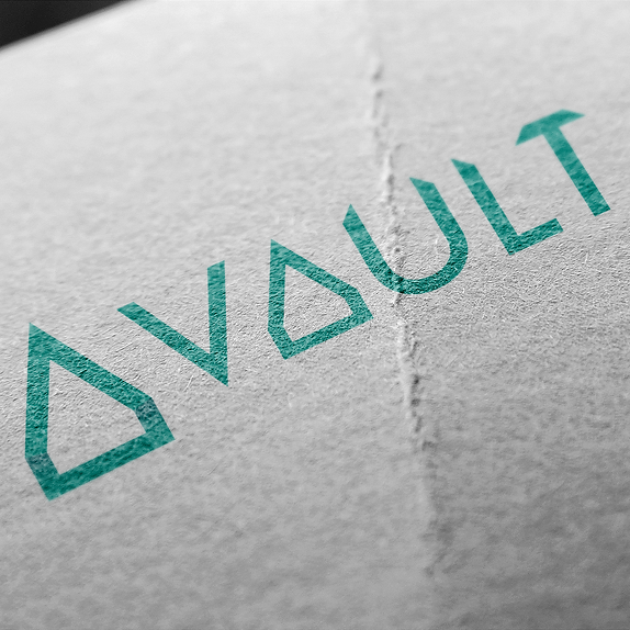
LOGO & BRANDING
For Vault, the concept is built straight from the brand’s DNA — the elegance of a vaulted ceiling reimagined as the central motif. The arch is subtly fused with the letter "A" to form a minimal yet striking wordmark that speaks for itself. No fluff, no over-explanation — just clarity with character.
The choice of an off-green, inspired by Tiffany’s iconic hue, breaks away from the expected. It’s a deliberate move to position Vault not merely as a ceiling systems brand, but as a name synonymous with luxury and refined taste. This isn’t construction branding — it’s aspirational identity design.


BRAND GUIDELINES
To ensure consistency across every touchpoint, a comprehensive brand guideline package was delivered to the client. Whether it's digital, print, or material-based applications, the guide provides clear, practical instructions for seamless execution. Visual mockups are included throughout — giving the client a clear picture of how the brand lives and breathes in the real world.